What Led Zeppelin Was Thinking With the ‘Bizarre’ ‘Presence’ Album Cover
As album covers go, you have to look hard to find one cooler than Led Zeppelin. For the band’s 1969 debut, Jimmy Page chose a picture of the Hindenburg (Luftschiff Zeppelin #129) going down in flames over New Jersey in 1937.
In some ways, it referenced the joke Keith Moon made about forming a band with Page then watching it crash spectacularly. But beyond that it represented the epic nature of Zep’s music and the sort of havoc the band might wreak on the music industry.
After another great cover for Led Zeppelin II (“the brown bomber”), the band’s album designs got stranger every time out. For Led Zeppelin III (1971), Page had to release the record with a pop-art showcase he didn’t like at all. (The artist had kept it hidden too long prior to deadline.)
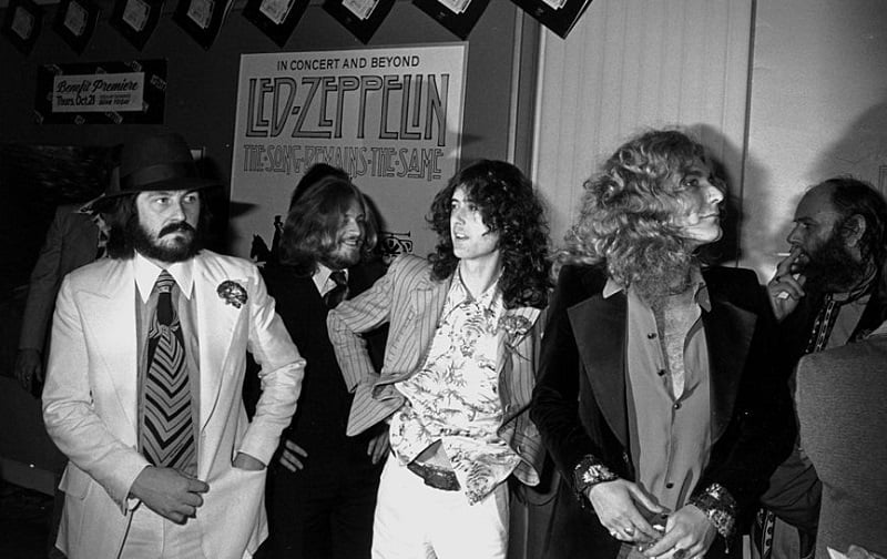
Next came two albums with no band name or title, followed by the brilliant cover of Physical Graffiti (1975). But when the band released Presence in ’76, the album cover featured the weirdest image Zep fans had seen to date.
Zeppelin named the album ‘Presence’ after seeing the design
Hipgnosis, the design firm behind the Houses of the Holy cover, also got the contract for Zep’s sixth studio album. On this occasion, the band came up with the title Presence after seeing the images that graced the front/back covers and gatefold.
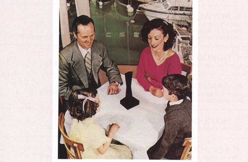
In each of the 10 images, you find 1950s suburban, middle-class figures at work or play, all of them contemplating a black object. This object neither casts a shadow nor reflects any light back from it. In a word, “The Object” has a commanding presence.
According to Aubrey Powell, one of the chief designers, The Object was “obtuse and bizarre, and it suited Led Zeppelin.” As far as the meaning behind it, he couldn’t say for sure. But the members of the band clearly liked it enough to keep it.
When reporters contacted Zeppelin’s press department to ask about it, they learned that no one there could answer their questions, either. Storm Thorgerson, who co-designed it with Powell, suggested the hard-to-define object had a lot in common with the band.
The black object could represent Zep’s place in rock — and society
According to designer Thorgerson, the black object can represent just about any strong presence. “The black object stands as being as powerful as one’s imagination cares it to be,” he told Dave Lewis. “We felt Zeppelin could rightfully feel the same way about themselves in the world of rock music.”
Like Zeppelin, The Object commands attention and scrutiny yet yields no clear answers. “Those people were trying to discover what The Object was — and how its presence is felt,” Thorgerson said. “I think the whole sleeve concept was very appropriate for Zeppelin — a very powerful band, musically and socially.”
While Zeppelin may have officially entered the Spinal Tap era in terms of cover art, it all came down to the music. If you wondered whether they still had the power and authority of rock’s biggest band, tracks like “Achilles Last Stand” and “Nobody’s Fault But Mine” put the question to bed.
“It was a reflection of the height of our emotions of the time,” Page said in 1993. “There are no acoustic songs, no keyboards, no mellowness.” Indeed, the album was as metal as Zeppelin got. As for the cover, feel free to think in “Kubrickian” terms, as Robert Plant suggested fans might.
Also see: How a John Bonham Drinking Song Became a Classic ‘Led Zeppelin III’ Track