Led Zeppelin’s Best Album Covers, Ranked
It was always about the music for Led Zeppelin. Sure, there were legendary exploits with groupies and constant partying between gigs on their private airplane, but the music was what mattered most. The tunes came first in the pecking order, but the album cover art wasn’t far behind, and we’re ranking the nine Led Zeppelin album covers from worst to first.
Note: Yes, we said nine. Led Zeppelin released eight studio albums (you won’t find The Song Remains the Same here) as an active band, but we’re including Coda since the group wrote and recorded songs from the album before they broke up in 1980. Speaking of Coda…

9. ‘Coda’ (1982)
Led Zeppelin’s founding guitarist Jimmy Page pieced together Coda two years after the band broke up since they owed Atlantic Records one more album. His skill in the recording booth helped him get away with a lie while making the record.
The band’s final album is better than you might remember, but the artwork is only so-so. The maze-like single lines recall the tubes of a neon sign, but Coda’s cover lacks color. Its stark palette was perhaps intentional, given that John Bonham’s untimely death brought Led Zeppelin to a premature end. Still, it’s the worst album cover from a band known for exceptional artwork.
8. ‘In Through the Out Door’ (1979)
John Paul Jones and Robert Plant were the creative forces behind In Through the Out Door. The band worked with the art firm Hipgnosis for the cover (and not for the first time).
The post-mortem album Coda lacks color, and so does Out Door. Browns, beiges, and other earth tones dominate the color scheme. It had a novel concept — six different covers, each shot from the point of view of one of the patrons from the featured bar scene; black-and-white photos that changed to color in water — but the execution was a little off.
Since it came wrapped in a brown bag, buyers never knew which In Through the Out Door album cover they were getting. The cover scene might make listeners think the album houses some gritty, road house-style guitar music, but Jones’ synth work dominates the record. In the end, the artwork is more stunning for its concept than its execution.
7. ‘Led Zeppelin III’ (1970)
It contains some of Zep’s best music and Page’s best guitar solo (non-“Stairway to Heaven” division), but the Led Zeppelin III album cover is another story. A spinning dial that displays different images within cutouts on the cover is a novel concept, but the busy collage-like approach on the front and back covers is a distraction. Page didn’t like it, and we have to agree it’s not the best of Led Zeppelin’s album covers.
6. ‘Presence’ (1976)
There’s something slightly unsettling about seeing a strange obelisk at the centerpiece of scenes of domestic tranquility. Love it or hate it, it makes the Presence cover instantly recognizable.
The general feeling of uneasiness conveyed by the cover telegraphs the music. It is Led Zeppelin’s most challenging album, one where heavy rock (“Achilles Last Stand,” “Nobody’s Fault But Mine”), harrowing blues (“Tea for One”), and genre exercises (funk on “Royal Orleans,” rockabilly on “Candy Store Rock”) all rub shoulders. It might have some bizarre artwork, but the Presence cover is one of Led Zeppelin’s most memorable, if not quite their best.
5. ‘Physical Graffiti’ (1975)
Zep’s only studio double album has a cover that conveys the nature of the record. The building facade — a photo of a New York City apartment building — takes up the entire cover, as if to indicate to listeners that they’re about to face a massive structure — a double album that stands tall in the band’s catalog as it takes fans on a journey across the musical spectrum.
4. ‘Led Zeppelin II’ (1969)
The Brown Bomber, an affectionate nickname for Led Zeppelin II, retains the burning blimp theme from Led Zeppelin I but with a slight tweak.
Cover artist David Juniper includes the faces of Page, Plant, Bonham, and Jones pasted over photos of World War I German fighter pilots. It’s an instantly recognizable cover that prominently features the band’s name. Yet it’s a bit derivative of the debut album’s jacket (also from 1969), which is why we don’t have it a bit higher in our ranking of Led Zeppelin album covers.
3. ‘Houses of the Holy’ (1973)
Led Zeppelin fired the original designer of the Houses of the Holy cover, Hipgnosis co-founder Storm Thorgerson. We’d say they made the right choice considering he pitched a bright green tennis court with a racket to boot.
The artist who took over, Aubrey Powell, created one of the most identifiable and eye-catching album covers of all time. The purplish tint on the naked children, the neon colored effects added to the rocks, and the bright orange sky make the Houses of the Holy cover stand out. (Just imagine walking past a giant vinyl LP with that artwork in the record store).
It’s one of Page’s most disliked Led Zeppelin covers, but Houses of the Holy’s artwork is one of Zep’s finest non-musical moments.
2. ‘Led Zeppelin I’ (1969)
Sometimes all you need to change the world is fair use art and some awesome music. At least if you’re Led Zeppelin.
The simple, eye-catching artwork on the front of Led Zeppelin I, which features a slightly altered image of the Hindenburg disaster, makes an instant statement. The conflagration sends a clear message — that Zep was about to torch the music world.
They did it with their songs and legendary concerts. Led Zeppelin’s album covers were nothing to scoff at, either. Especially the record at No. 1 on our list.
1. ‘Led Zeppelin IV’ (1971)
Remember how we said it was all about the music for Led Zeppelin? The legendary cover of Led Zeppelin IV is case in point.
The front features a painting of a crooked-backed, hermetic-looking man and doesn’t include the band’s name. The spine and back don’t have Led Zeppelin’s name or the album’s title on them. You won’t find the names of Page, Plant, Jones, or Bonham on the inside; each band member is represented by four symbols instead.
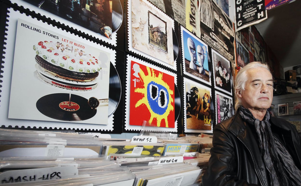
During a career stacked with gallery-worthy artwork, the Led Zeppelin IV album cover made a clear statement — judge the music, not the players. Seeing that the album sold millions of copies over 50-plus years, the fans cleary heard the message loud and clear. England Royal Mail service gave Zep a high honor when it picked IV as one of the few album covers to receive commemorative stamp treatment.
Some of Led Zeppelin’s album covers might leave a little to be desired, but the band’s best artwork are nearly modern art masterpieces.
For more on the entertainment world and exclusive interviews, subscribe to Showbiz Cheat Sheet’s YouTube channel.