Why Led Zeppelin Threw Out the Original Designer of the ‘Houses of the Holy’ Cover
Led Zeppelin came out swinging with its early album cover designs. From the explosive image on Zep’s ’69 debut to the Grammy-nominated “Brown Bomber” cover of Led Zeppelin II, the band made certain the art matched the power of its music.
But after strong showings on Led Zeppelin III (1970) and ’71 untitled fourth LP (aka “Zoso”), the Zep decided to try something new for Houses of the Holy (1973). The band hired Hipgnosis, the firm behind Pink Floyd’s album covers since the late ’60s.
Zeppelin’s first meeting with Hipgnosis didn’t go well. When Storm Thorgerson turned up with his first crack at the Houses of the Holy cover, Jimmy Page and his bandmates were appalled. And they promptly threw Thorgerson out of the room.
Led Zeppelin was insulted by the 1st pitch for the ‘Houses of the Holy’ cover
Thorgerson founded with Hipgnosis with Aubrey Powell, and the two had enjoyed a great run of success prior to the Zeppelin meet. Their work included Floyd’s A Saucerful of Secrets (1968) as well as Electric Warrior (1971) by T. Rex.
Yet those winning designs didn’t prepare Led Zeppelin for Thorgerson’s idea. “This guy Storm came in carrying this picture of an electric green tennis court with a tennis racket,” Page recalled in a 1993 interview with Guitar World (via Classic Rock Review).
“I said, ‘What the hell does that have to do with anything?’ And [Thorgerson] said, ‘Racket — don’t you get it?’ I said ‘Are you trying to imply that our music is a racket? Get out!’ We never saw him again. We ended up dealing with one of the other artists [laughs].”
Though two decades had passed since the meeting, Page still sounded amazed at Thorgerson’s pitch. “That was a total insult — racket,” he told Guitar World in ’93. “He had some balls! Imagine. On a first meeting with a client!”
Aubrey Powell of Hipgnosis based the design on an Arthur C. Clarke novel
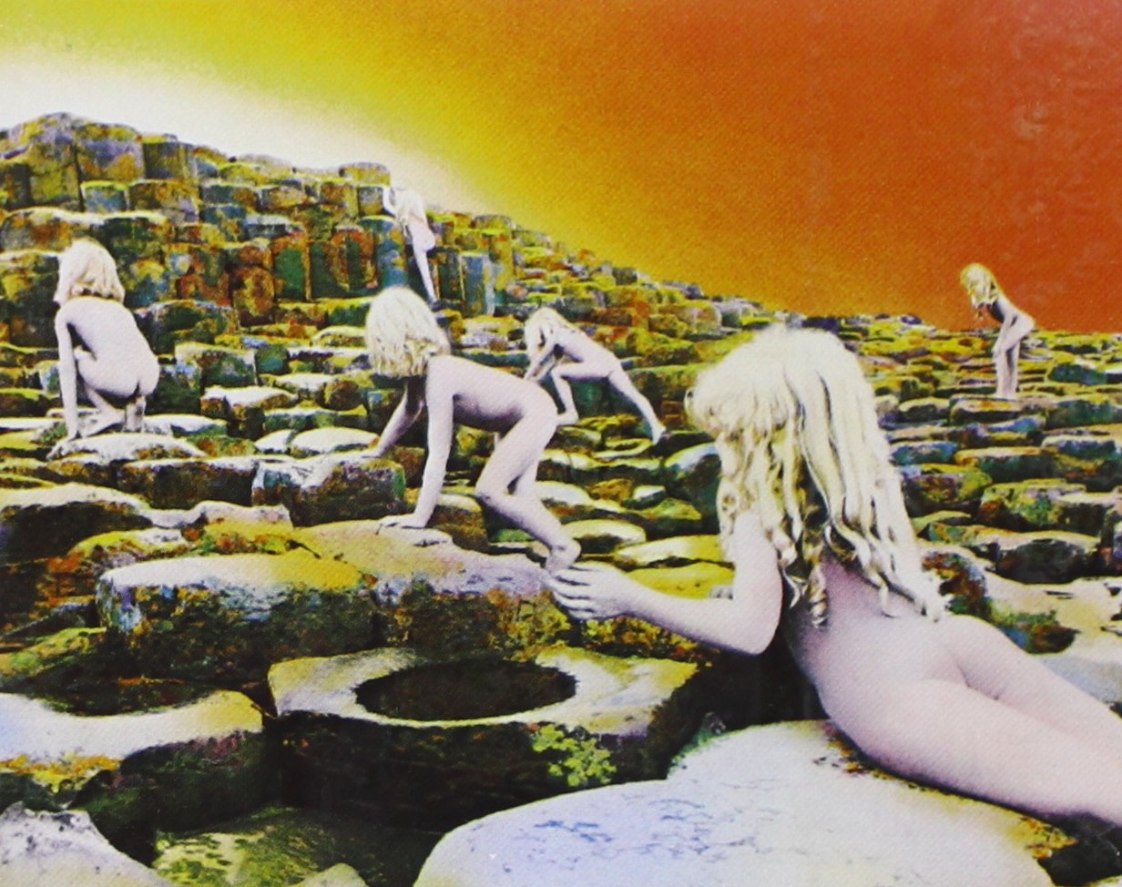
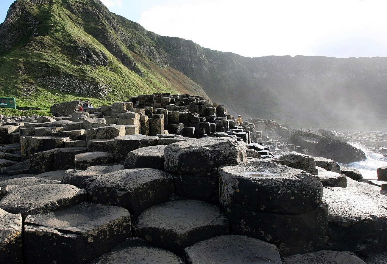
After Zeppelin dispensed with Thorgerson, his partner Aubrey Powell took over. He pitched the band members an idea based on Arthur C. Clarke’s 1953 novel Childhood’s End. Powell had two ideas, and one of them was photographing children on the Giant’s Causeway in Northern Ireland.
Yet Powell warned the band (there with manager Peter Grant) that such a shoot would get really expensive. “Peter Grant said, ‘Money? We don’t f*cking care about money. Just f*cking do it,'” Powell later recalled (via Super Seventies).
Since the day Powell photographed the children was gray and rainy, it affected the way the cover came out. “Originally, I’d intended the children to be gold and silver,” Powell said. “Because I shot in black and white […], the children turned out very white. So when we hand-tinted it, the airbrush artist, by accident, put a kind of purple tinge onto them.”
At first, Powell was frightened they’d botched it. But he quickly realized he had something special. “I said, ‘Hang on a minute — this has an otherworldly quality,'” he said, via Super Seventies. “So we left it as it was.” After such a poor start to their relationship, Hipgnosis delivered on Houses of the Holy. And it became another Grammy-nominated Zep cover.