‘Ozark’s Title Card Symbols Mean More Than Fans Realize
Many Ozark fans know the symbols in the title cards foreshadow the action in the episodes. However, the symbols do a bit more than that. Find out what the symbols in the title cards of the Netflix series create that fans might not have noticed.
Jason Bateman didn’t want the ‘Ozark’ credits to be boring
“Don’t you hate [watching] a minute and a half of credits for a show you watch all the time?” Bateman, who plays Marty Byrde in the series, said on The Tonight Show With Jimmy Fallon. “It’s like, let’s get to the story.”
Together with graphic artist Neil Kellerhouse, who is known for his work with David Fincher, Bateman set out to make the Ozark credits stand out. “I didn’t want to do like a credits sequence,” he continued. “I wanted to do something that was … 5 seconds long.”
‘Ozark’ symbols foreshadow important plot points
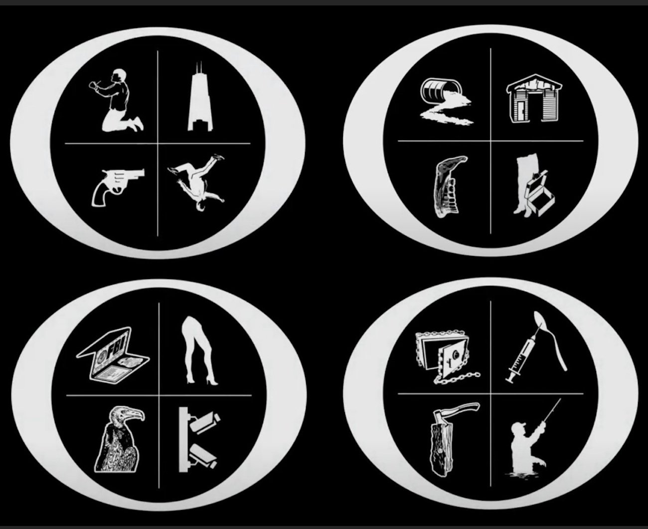
Since Ozark began, the title cards have contained hints about what will happen in each episode. The four seemingly unrelated signs give fans an idea of four pivotal moments in any episode.
For example, the pilot episode’s title card features a man begging on his knees with his hands tied, symbolizing Marty Byrde begging Camino Del Rio (Esai Morale) for his life. It also shows a falling man; this represents Wendy Byrde’s (Laura Linney) lover, Gary “Sugarwood” Silverberg (Bruce Altman), who is thrown off of his Chicago high-rise balcony in the pilot.
‘Ozark’ symbols also spell out the title of the Netflix series
The four symbols inside of the “O” don’t just tease what’s going to happen in episodes. They’re carefully arranged to spell out the name of the Netflix series.
More specifically, the symbol in the top left quadrant always resembles a “Z” and the one next to it resembles an “A.” The bottom two symbols are always arranged to look like an “R” and a “K” so that the title card spells out Ozark every time.
“[We] put the name of the show in this little 5-second thing,” Bateman elaborated on The Tonight Show. “[We] do symbols that are in the shape of Z A R K [within the ‘O’].”
‘Ozark’ title font might also have meaning
In a discussion on Reddit, fans talked about the font Ozark is written in at the start of each episode. “Considering that Ozark is an incredibly well-made show with exceptionally great acting, writing, world-building, and directing … does the fact that the opening title credits use the MOST basic and generic font bother anyone else?” asked one Redditor.
According to another Reddit user in the comments, the “basic” font was intentional. “The whole point of the show is a boring, ‘typical’ family gets caught up in the wild world of drugs,” they wrote. “The boring font represents the ‘boring’ family.”
Another Redditor agreed, calling the font a “decoy” for what the show is really about. “Just like the deceptive ‘regular’ look the central characters of the show put on, the font looks ordinary like the Byrdes.” As fans know, the Byrde family is anything but ordinary.
Watch the final episodes of Ozark on Netflix.